Sitting down to a lovely evening meal of Chinese dumplings and Newton’s Ridge Pinot Grigio, we soaked up the warm summer evening’s sights and sounds of the approaching dusk.
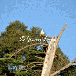
Casting an eye over at the fallen Cypress, we saw something, scattering bits of fluff on top of the old cracked stem. A juvenile black shouldered kite appeared to be enjoying his meal in the relative quiet atop. Bothered only by butterflys and taking time to spread its wing to let the day’s warmth dissipate.
I would never have made a good milkman. This 4am waking is killing me. Ordinarily I’d stay up to see 4am, but getting up to see it is just crazy talk.
Defeated by clouds, rain & Christmas the past few days, this was my first opportunity to have a look since Christmas Eve. Comet Lovejoy had noticeibly dimmed, perhaps half to one magnitude. It had also shifted where previous observation had put it half a degree or so to the west of the Pointers, it was now slight to the right of them.
A stiff breeze shifted the intermittant clouds past us, so there was some good viewing as well as spotting 2 satellites, the ISS, and a few meteorites. Barry had his trusty 12 inch dob set up and we got crisp viewing of Omega Centauri and Saturn & its moons.
I’d been vaguely following a few comets this year including the one that got eaten by the sun but only read in last night’s paper that Comet Lovejoy which narrowly missed the sun itself, has put out a lovely tail and is clearly visible in the wee hours.
Here’s the NASA video from the ISS.
So, I thought iI’d give it a go. An hour or so before dawn is what Spaceweather said, I grabbed my trusty D300s, tripod & remote & headed South to see what I could see.
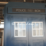
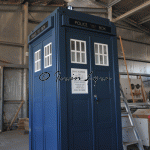
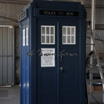
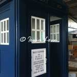
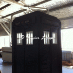
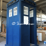
With just a small handful of finishing touches to go, time has defeated me for 2011. I’ll sign off from TARDIS construction with some pictures of progress so far.
Deep breath time, I still haven’t received the balance of LED strips so cannot complete the project today. I’ve devoted the time to cleaning up what is there. I decided to cannibalise two good strips to replace the sections of defective strips while I had the time. Also I thought I’d remove the clunky (but convenient!) joiners and replace them with some cut to size self soldered (nice looking) joins.
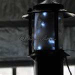
I also thought I’d have a go at mounting and wiring the lantern while I had the time. Done, the height of the lantern doesn’t quite give me the look I was hoping for so I’m going to put some extra thought into that. I think it’s too tall proportionally speaking (a design feature of using a bollard light).
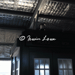
Wiring wise, the Christmas LEDs have come up a treat. I’ve also worked out that there are 2 sets of LEDs to give various strobing effects coming from the controller. A small amount of tinkering & I discovered a way to wire up each side of the TARDIS separately so that the strobes will be coordinated.
It’s been a while since I’ve had to remember wiring, soldering, & basic DC stuff. Luckily the prefab LED light strips come prewired & with rather obvious + and – polarity indicators on the printed circuit boards, so it’s just really up to me to ensure I get the polarity (of the neutron flow!) correct.
Dissapointment number two with regards to the LED purchase is the number of defective LED strips that Jaycar sold me. I’d already opened and chopped up to size the strips, so no hope of getting a refund there. Had I looked closer and took notice when I opened each sealed pack, it would have jumped out at me that a couple of packs were already opened and taped back up (instead of being heat sealed), and the PCB solder points looked like somebody had already had a go. Damn.
Still dealing with disappointment number one (being short sent a good number of strips) and still waiting for the balance to arrive. I’ve powered up as I’ve gone along to make sure that (barring defective strips) at least I’ve got the wiring correct.
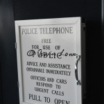
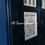
Nerve racking event number two – the light box signs. Being of black vinyl transfer, I was rather conscious of not stuffing these up either by scratching or inadvertantly gluing and then having accident evident stains.
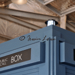
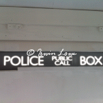
I lined up the centre of the structure gaps, got the clear liquid-nails ready and took a deep breath. Somehow, I imagined that the centre of the signs themselves were in the mid of the “Public Call” bit. Because “police” “box” are different lengths, the centre of the sign is weighted towards the left “P” of “Public”. Good thing I decided to start on the rear panel. Having used the glue several times over a few weeks now, It was quite claggy- slightly beneficial for me as runny would have been worse.
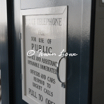
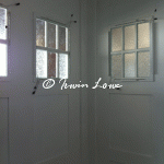
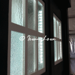
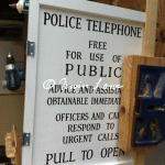
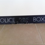
The inverted sign shows how the letters appear bigger when light streams though (flipped for effect).
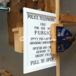
Who’d have thought the moment of truth would be so nerveracking? I needed to cut some very fine mortises for the finer jewelry box hinges I’d chosen for the phone door sign. A dry fitting showed that the flap (which I’d constructed way back in 2009 as one of the things that I was able to easily do at the time) fitted snugly. Which meant that the hinges & mortises for them would have to be rather precise.
I padded the clamp with some offcuts and sliced delicately away with a coping saw. A small excess needed removing so a small tap with the chisel and @#$%crunch@#$% up comes a sliver that I didn’t mean to do. A small dab of PVA and some masking tape later, the second mortise is cut and the door fitted in place. Probably a bit too snug- I’ll have to contemplate some fine sanding to remove the tightness.
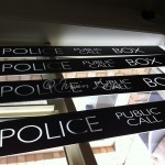
I’d asked a friend, signwriter Ian Currell to prepare the TARDIS signs for me a few weeks back. He got so excited by the slightly offbeat commission, that he cleared his decks and jumped to it straight away. It’s always exciting to find others excited in your project.
I’d sourced 4 opaque perspex panels from a second-hand pharmacy cosmetic display which was being junked. I cut these to size and envisaged using vinyl transfers for the signs. I’d also thought of similar vinyl transfers for the phone flap sign.
Until I met up with Ian. He buzzed with excitement and said that (back in the day) such signs would have been handwritten. And so that’s what he’d do. I’d envisaged using the modern font sizes and spacing, but decided on following the original Brachaki prop. I sourced a screencap from the pilot episode of “An Unearthly Child” (1963) and we went with that.
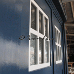
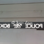
We’d used a thinner font on the lightbox panels as these would make the letters look “normal” when backlit & from a distance, which is the effect I’m after.
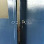
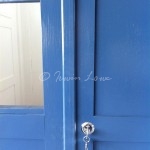
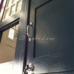
The door lock took me longer than expected due to my having used a thinner timber stock than would be usual for a door. This was a deliberate decision at the time as I didn’t want the doors to be too heavy, and since I was starting with the doors, I felt that the entire construct would be too heavy set had I gone this way.
So now it bites me. I’d prepared a 3mm shim last week on discovering this but after about 30 minutes of mucking around, discovered that I really needed at least 8-10mm. Luckily there’s heaps of spare timber and offcuts lying around, so a few chops later, a nice mount for the lock is complete.
Got a call from Anna half way during the day saying that the signwriter’s ready with the signs. Very exciting.
Just another WordPress site