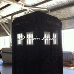
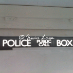
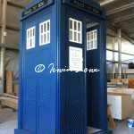
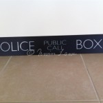
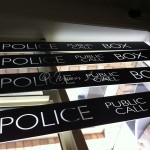
Nerve racking event number two – the light box signs. Being of black vinyl transfer, I was rather conscious of not stuffing these up either by scratching or inadvertantly gluing and then having accident evident stains.
I lined up the centre of the structure gaps, got the clear liquid-nails ready and took a deep breath. Somehow, I imagined that the centre of the signs themselves were in the mid of the “Public Call” bit. Because “police” “box” are different lengths, the centre of the sign is weighted towards the left “P” of “Public”. Good thing I decided to start on the rear panel. Having used the glue several times over a few weeks now, It was quite claggy- slightly beneficial for me as runny would have been worse.
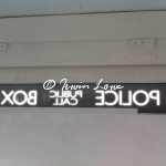
The inverted sign shows how the letters appear bigger when light streams though (flipped for effect).
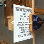
Who’d have thought the moment of truth would be so nerveracking? I needed to cut some very fine mortises for the finer jewelry box hinges I’d chosen for the phone door sign. A dry fitting showed that the flap (which I’d constructed way back in 2009 as one of the things that I was able to easily do at the time) fitted snugly. Which meant that the hinges & mortises for them would have to be rather precise.
I padded the clamp with some offcuts and sliced delicately away with a coping saw. A small excess needed removing so a small tap with the chisel and @#$%crunch@#$% up comes a sliver that I didn’t mean to do. A small dab of PVA and some masking tape later, the second mortise is cut and the door fitted in place. Probably a bit too snug- I’ll have to contemplate some fine sanding to remove the tightness.
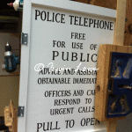
I’d asked a friend, signwriter Ian Currell to prepare the TARDIS signs for me a few weeks back. He got so excited by the slightly offbeat commission, that he cleared his decks and jumped to it straight away. It’s always exciting to find others excited in your project.
I’d sourced 4 opaque perspex panels from a second-hand pharmacy cosmetic display which was being junked. I cut these to size and envisaged using vinyl transfers for the signs. I’d also thought of similar vinyl transfers for the phone flap sign.
Until I met up with Ian. He buzzed with excitement and said that (back in the day) such signs would have been handwritten. And so that’s what he’d do. I’d envisaged using the modern font sizes and spacing, but decided on following the original Brachaki prop. I sourced a screencap from the pilot episode of “An Unearthly Child” (1963) and we went with that.
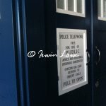
We’d used a thinner font on the lightbox panels as these would make the letters look “normal” when backlit & from a distance, which is the effect I’m after.
Just another WordPress site
