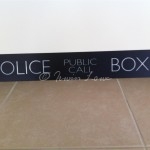
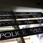
I’d asked a friend, signwriter Ian Currell to prepare the TARDIS signs for me a few weeks back. He got so excited by the slightly offbeat commission, that he cleared his decks and jumped to it straight away. It’s always exciting to find others excited in your project.
I’d sourced 4 opaque perspex panels from a second-hand pharmacy cosmetic display which was being junked. I cut these to size and envisaged using vinyl transfers for the signs. I’d also thought of similar vinyl transfers for the phone flap sign.
Until I met up with Ian. He buzzed with excitement and said that (back in the day) such signs would have been handwritten. And so that’s what he’d do. I’d envisaged using the modern font sizes and spacing, but decided on following the original Brachaki prop. I sourced a screencap from the pilot episode of “An Unearthly Child” (1963) and we went with that.
We’d used a thinner font on the lightbox panels as these would make the letters look “normal” when backlit & from a distance, which is the effect I’m after.